The Therapist's Guide to a Strong Visual Brand Identity

Welcome to the visual wonderland of branding, where every color, font, and image tells a story about who you are and what you stand for. In the world of therapy, your visual brand identity isn't just about looking good—it's about building trust, creating connections, and setting the stage for a welcoming client experience. Whether you're just starting out or looking to revamp your existing brand, this guide will walk you through the essential steps to craft a strong visual brand identity that resonates with your clients and reflects your practice’s unique personality. So, grab a cup of coffee, settle in, and let’s get creative!
IN THIS ARTICLE:
Understanding Visual Brand Identity
Ah, visual brand identity—the snazzy outfit your private practice wears to stand out in a sea of sameness. But it’s more than just a pretty face (though that helps). It’s about crafting a visual narrative that resonates with your clients, communicates your values, and sets the tone for their experience with you as their therapist.
What is Visual Brand Identity?
In simple terms, your visual brand identity is how you visually communicate who you are as a therapist and what you and your practice stand for. It includes everything from your logo and color palette to your typography and imagery. Think of it as your practice’s visual wardrobe.
Why is it Important?
First Impressions Matter: You know the saying, "You never get a second chance to make a first impression." In the digital age, your visual brand identity is often what makes that first impression. You have mere seconds after someone encounters your brand for the first time to send the right visual cues about yourself and your practice.
Consistency Builds Trust: A consistent visual identity across all platforms and materials helps build trust and recognition. Clients know what to expect and feel more comfortable. Research has shown that it can take up to 7 encounters with your brand before people begin to remember and recognize your brand. The number of touches required to establish brand recognition sky rockets with inconsistent visual branding. That’s why consistent branding can actually decrease the cost of your marketing — less touches required, less ad spend to get results!
Differentiation: A strong visual identity helps you stand out from the crowd, showcasing what makes your practice unique.
Professionalism: A cohesive visual brand identity shows that you’re serious about your practice and committed to providing a professional service.
The Components of Visual Brand Identity
Logo: Your logo is the cornerstone of your visual identity. It’s a visual shorthand for your brand.
Color Palette: Colors evoke emotions and set the tone for your brand. Choose wisely!
Typography: The fonts you use convey personality and readability.
Imagery: The photos and graphics you choose should align with your brand’s message and values.
Graphic Elements: These include patterns, icons, and other design elements that add to your visual story.
By understanding these components, you can start to build a visual identity that truly reflects your practice. And remember, while building a strong and comprehensive visual brand identity can seem daunting, it’s a powerful tool to connect with your clients and communicate the most important things about your brand.

Crafting Your Brand Story
Alright, it’s story time! But this isn’t your average bedtime tale. Crafting your brand story is about creating a narrative that encapsulates who you are, what you stand for, and why clients should choose you over the therapist next door.
What is a Brand Story?
A brand story goes beyond your logo or tagline. It’s the narrative that connects your purpose, values, and the unique experience you offer. It’s not just what you do, but why you do it and how it impacts your clients.
Why Your Brand Story Matters
Emotional Connection: People connect with stories on an emotional level. A compelling brand story can make potential clients feel understood and valued.
Memorability: A good story sticks. It’s more memorable than a list of services or credentials.
Authenticity: Sharing your journey and values makes your practice feel more authentic and trustworthy.
Differentiation: Your story is uniquely yours. It helps you stand out in a crowded market.
How to Craft Your Brand Story
Start with Your Why: Why did you become a therapist? What drives you to help others? Simon Sinek’s famous mantra, "Start with Why," is a great place to begin.
Identify Your Values: What core values guide your practice? Compassion, integrity, innovation? List them out.
Highlight Key Milestones: Share pivotal moments in your journey—education, experiences, challenges overcome, and successes.
Focus on Your Clients: How do you help your clients? What transformations have they experienced? Use testimonials and case studies to illustrate this.
Keep it Genuine: Authenticity is key. Don’t embellish or fabricate details. Your story should be true to you.
Putting Your Story Together
Combine these elements into a cohesive narrative. Here’s a simple structure to follow:
Introduction: Who are you?
Background: What led you to this point?
Your Why: Why do you do what you do?
Client Impact: How do you make a difference?
Vision: Where are you headed?
By the end of this exercise, you’ll have a powerful brand story that resonates with your audience and sets the stage for all your visual branding efforts.
Designing Your Logo
Now that you’ve got your brand story locked and loaded, it’s time to put it into visual form. Enter: your logo. Think of your logo as the face of your practice—it’s often the first thing people see and the image that sticks in their minds. So, let’s make it count!
The Role of a Logo
A logo is more than just a pretty picture. It’s a visual representation of your brand’s identity. It should encapsulate your story, values, and the essence of your practice in a simple, memorable design.
Key Elements of a Great Logo
Simplicity: A great logo is simple and easily recognizable. Think Apple, Nike, or McDonald's. Less is often more.
Relevance: Your logo should be relevant to your field and your brand story. It needs to resonate with your target audience.
Versatility: It should look good in various sizes and formats—from business cards to billboards.
Timelessness: Aim for a design that won’t look outdated in a few years. Trends are great, but timelessness wins the race.
Uniqueness: Your logo should set you apart from the competition. Avoid clichés and aim for originality.

Steps to Designing Your Logo
Research & Inspiration: Start by looking at logos in the therapy field and beyond. Notice what works and what doesn’t.
Define Your Concept: Based on your brand story and values, brainstorm ideas and concepts that could represent your practice.
Sketch It Out: Don’t worry about artistic skills—just get your ideas on paper. Sketch multiple versions and variations.
Choose Your Style: Decide on the style of your logo—modern, classic, playful, or sophisticated? Choose a style that aligns with your brand.
Hire a Professional: If design isn’t your forte, consider hiring a professional logo designer. A skilled designer can bring your vision to life and ensure it meets all the key elements.
Refine & Finalize: Work with your designer to refine the logo until it’s perfect. Remember that the goal is not for it to appeal to you but to your audience.
Logo Types to Consider
Wordmark: A stylized version of your practice’s name.
Lettermark: An abbreviation or initials (e.g., HBO, CNN).
Icon/Symbol: A graphic symbol that represents your practice.
Combination Mark: A mix of a symbol and a wordmark (e.g., Starbucks).
Emblem: A symbol integrated with text (e.g., Harley-Davidson).
Creating a strong logo is a crucial step in establishing your visual brand identity. It’s worth taking the time to get it right—after all, this little design will do a lot of heavy lifting for your brand!
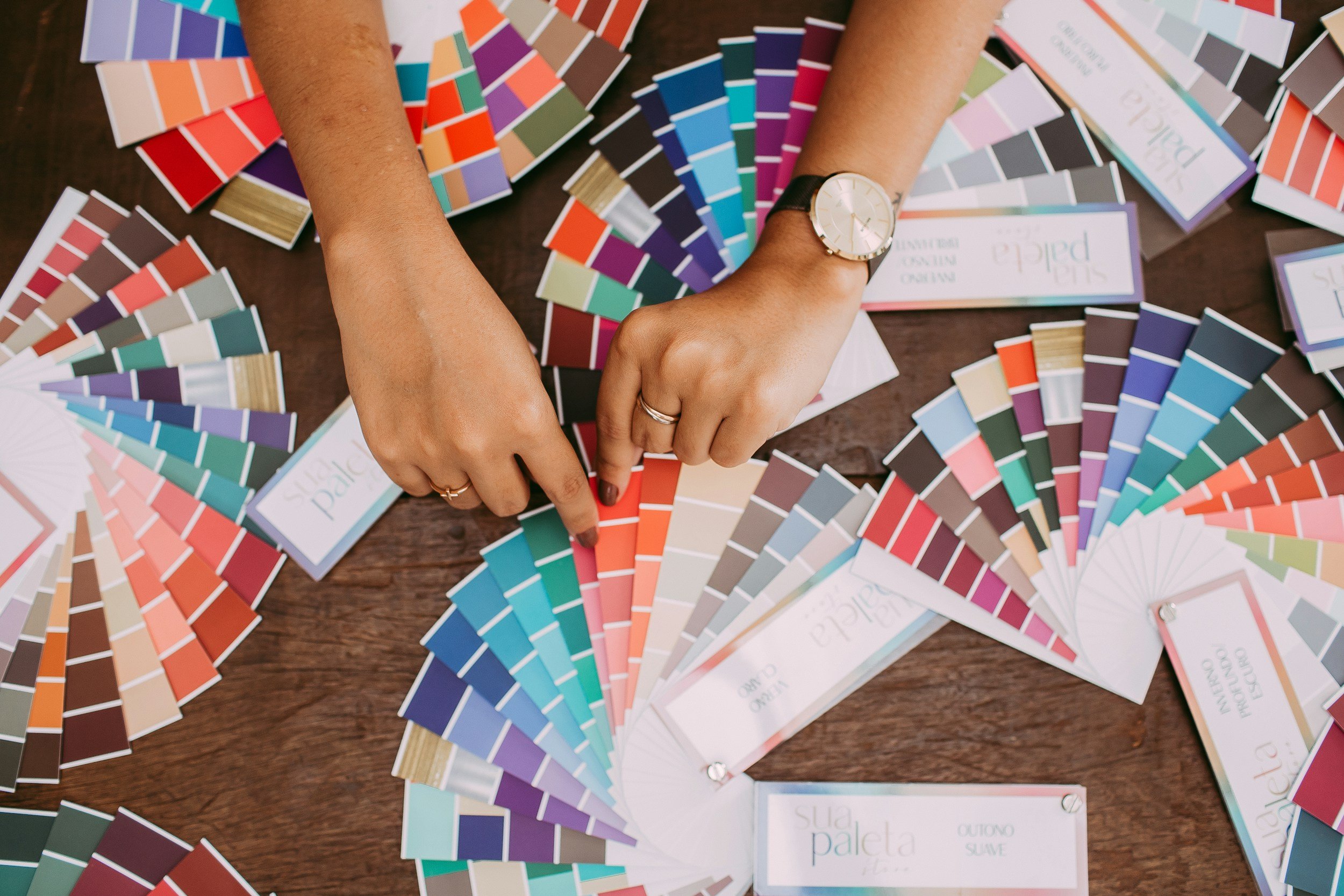
Choosing Your Color Palette
Now that you’ve got your logo sorted, it’s time to dive into the colorful world of palettes. The colors you choose for your brand are more than just eye candy—they play a crucial role in how your practice is perceived and the emotions they evoke in your clients. Let’s get colorful!
The Psychology of Colors
Colors have a profound impact on our emotions and behaviors. Here’s a quick rundown of what different colors typically represent:
Blue: Trust, professionalism, calmness (great for therapy practices)
Green: Growth, tranquility, health
Purple: Wisdom, luxury, creativity
Yellow: Optimism, happiness, energy
Orange: Enthusiasm, warmth, playfulness
Red: Passion, urgency, excitement
Black: Sophistication, elegance, authority
White: Purity, simplicity, cleanliness
Choosing the right colors can help communicate your brand’s personality and values at a glance.
Building Your Color Palette
Primary Colors: Choose 1-2 main colors that will dominate your brand’s visual identity.
Secondary Colors: Select 1-2 secondary colors that complement your primary colors. These can be used for accents and variety.
Neutral Colors: Include neutral shades (like black, white, grey, beige) for backgrounds, text, and balancing brighter colors.
Tips for Choosing Your Palette
Align with Your Brand Story: Your colors should reflect your brand’s personality and values. For example, if your practice focuses on creating a calm and safe environment, consider using blues and greens. If your brand’s personality is more fun and playful, try orange or purple.
Consider Your Audience: Think about the preferences and expectations of your target audience. Soft, muted colors might appeal to a calming therapeutic setting, while brighter more energetic colors could be suitable for children.
Test for Accessibility: Ensure your color choices are accessible to all users, including those with color blindness. Tools like the Web Content Accessibility Guidelines (WCAG) can help.
Create Balance: Use a mix of light and dark colors to create contrast and hierarchy in your designs.
Tools to Help You Choose
Applying Your Palette
Once you’ve chosen your colors, use them consistently across all your brand touchpoints:
Website: Backgrounds, buttons, links, headers.
Printed Materials: Business cards, brochures, flyers.
Digital Content: Social media graphics, email newsletters.
Office Space: Décor, signage, uniforms.
A cohesive color palette helps create a unified and professional look for your practice, making it instantly recognizable and memorable.
Typography Matters
Alright, font enthusiasts, it’s time to talk typography! You might think fonts are just the letters on the page, but they’re so much more. The typography you choose can greatly influence how your brand is perceived and how readable your content is. So, let’s delve into the art of picking the perfect typeface.
The Role of Typography
Typography isn’t just about making your text legible; it’s about conveying your brand’s personality and ensuring your message comes across clearly. Different typefaces can evoke different feelings—some are serious, others are playful, and some are downright elegant.
Choosing the Right Typeface
Brand Personality: Your typeface should reflect your brand’s personality. For a therapy practice, you might want something professional and calming rather than something too quirky or aggressive.
Readability: Ensure your chosen fonts are easy to read, especially on digital screens. Avoid overly decorative fonts for body text.
Versatility: Your typefaces should work well in various sizes and contexts, from headers to body text to small print.
Pairing Fonts: Choose a primary font for headings and a secondary font for body text. Make sure they complement each other without clashing.
Types of Fonts
Serif Fonts: These fonts have little “feet” at the ends of their letters (like Times New Roman). They’re seen as traditional and trustworthy.
Sans-Serif Fonts: These fonts lack the little “feet” (like Arial or Helvetica). They’re modern, clean, and easy to read on screens.
Script Fonts: These fonts mimic cursive handwriting (like Brush Script). They can add a personal, elegant touch but should be used sparingly.
Display Fonts: These are decorative fonts meant for attention-grabbing headlines (like Impact). They’re best used sparingly to add flair.
Tips for Effective Typography
Limit Your Fonts: Stick to 2-3 fonts to keep your design cohesive and avoid a cluttered look.
Hierarchy: Use different font sizes, weights, and styles to create a visual hierarchy and guide readers through your content.
Consistency: Use your chosen fonts consistently across all your materials—website, business cards, brochures, etc.
Line Spacing & Alignment: Pay attention to line spacing and text alignment to ensure readability and a clean layout.
Tools for Typography
Google Fonts: A free resource with a wide range of web-friendly fonts.
Adobe Fonts: Offers a vast library of fonts for use in various design projects.
Font Pair: Helps you find great font combinations that work well together.
Applying Your Typography
Use your chosen typefaces consistently across all brand touchpoints:
Website: Ensure your fonts are web-safe and load correctly across browsers.
Printed Materials: Check how your fonts print in different sizes and on various types of paper.
Digital Content: Use your fonts in social media graphics, emails, and presentations.
Typography is a powerful tool in your branding arsenal. By choosing the right typefaces and using them effectively, you can enhance your brand’s professionalism and readability.
Imagery & Visual Elements
Now that we've nailed down your logo, color palette, and typography, it's time to add some visual pizzazz with imagery and other visual elements. These components help tell your brand story in a more dynamic way, creating an emotional connection and enhancing the overall aesthetic of your practice.
The Power of Imagery
Images are a powerful tool in your branding toolkit. They can evoke emotions, illustrate concepts, and make your content more engaging. The right imagery can help potential clients feel a connection to your practice before they even step through your door.
Choosing the Right Images
Authenticity: Use images that feel genuine and relatable. Stock photos can be useful, but choose ones that don’t feel overly staged or artificial.
Relevance: Your images should align with your brand story and the message you want to convey. For example, if your practice focuses on mindfulness, use calming and serene images.
Quality: High-resolution images are a must. Blurry or pixelated photos can make your brand look unprofessional.
Diversity: Ensure your images represent the diverse range of clients you serve. Inclusivity in your visuals shows that everyone is welcome.
Types of Visual Elements
Photographs: Use professional photos of your office space, team, and client interactions (with permission, of course).
Illustrations: Custom illustrations can add a unique and personal touch to your branding.
Icons: Use icons to highlight key points, make lists more engaging, and break up text.
Patterns & Textures: Incorporate subtle patterns or textures in your backgrounds to add depth and interest.
Tips for Using Visual Elements
Consistency: Maintain a consistent style across all images and visuals to create a cohesive look.
Color Coordination: Ensure your images and visual elements complement your color palette.
Purposeful Use: Use visuals to support your content, not distract from it. Every image should have a clear purpose.
Accessibility: Make sure your images are accessible by adding alt text for screen readers and ensuring good contrast.
Sourcing Your Visuals
Professional Photography: Hiring a professional photographer to capture your practice can be a worthwhile investment.
Stock Photos: Websites like Unsplash, Pexels, and Shutterstock offer high-quality stock photos.
Custom Illustrations: Work with a graphic designer to create custom illustrations that reflect your brand’s personality.
Icon Libraries: Resources like Font Awesome and The Noun Project offer extensive collections of icons.
Integrating Visual Elements
Website: Use images and icons to make your website more engaging and visually appealing.
Social Media: Share visuals that tell your brand story and engage with your audience.
Printed Materials: Incorporate imagery in brochures, business cards, and flyers to make them more attractive.
Office Space: Use visual elements in your office decor to create a welcoming and branded environment.
Great imagery and visual elements can elevate your brand, making it more memorable and engaging for your clients. By carefully selecting and using these elements, you can enhance your visual brand identity and create a more compelling experience for your audience.
Creating Brand Guidelines
So, you’ve got your logo, color palette, typography, and imagery all set. Now what? It’s time to tie everything together with a neat little bow called brand guidelines. Think of brand guidelines as your brand’s rulebook—a document that ensures consistency across all your marketing materials and communications.
What Are Brand Guidelines?
Brand guidelines are a comprehensive document that outlines how your brand should be presented to the world. They cover everything from logo usage to color specifications, typography rules, and more. Essentially, they help maintain the integrity of your brand by providing clear instructions on how to use your visual elements.
Why You Need Brand Guidelines
Consistency: They ensure that your brand looks the same everywhere—on your website, social media, business cards, and more.
Professionalism: Consistent branding looks polished and professional, building trust with your audience.
Efficiency: With clear guidelines, you and your team can quickly and easily create on-brand materials.
Brand Recognition: Consistent use of visual elements makes your brand more recognizable and memorable.
Key Components of Brand Guidelines
Logo Usage: Outline how your logo should be used, including size, placement, and any variations (e.g., full color, black and white).
Color Palette: Specify your primary, secondary, and neutral colors with their exact color codes (HEX, RGB, CMYK).
Typography: Detail the fonts you use, including styles, sizes, and where each font should be applied (e.g., headings vs. body text).
Imagery: Provide guidelines for selecting and using images, including style, tone, and any specific requirements (e.g., high resolution, diversity).
Visual Elements: Include rules for any patterns, textures, or icons, specifying how and when they should be used.
Tone & Voice: Though not a visual element, it’s important to outline the tone and voice of your written communications to ensure they align with your brand’s personality.
Examples: Provide visual examples of correct and incorrect usage of your brand elements to clarify your guidelines.
How to Create Your Brand Guidelines
Gather Your Elements: Collect all your brand’s visual elements—logo files, color codes, fonts, imagery, etc.
Document Layout: Decide on the layout and structure of your guidelines. A simple, easy-to-navigate document works best.
Detail Each Element: Clearly explain how each visual element should be used. Include do’s and don’ts to eliminate any guesswork.
Include Examples: Visual examples help illustrate your guidelines and make them easier to understand.
Review & Revise: Once your guidelines are drafted, review them with your team and make any necessary revisions.
Using Your Brand Guidelines
Share with Your Team: Ensure everyone in your practice has access to the brand guidelines and understands their importance.
Consistent Application: Apply the guidelines consistently across all platforms and materials.
Update Regularly: As your brand evolves, update your guidelines to reflect any changes.
Creating comprehensive brand guidelines is essential for maintaining a strong, cohesive brand identity. They serve as a valuable resource for you and your team, ensuring that every piece of communication looks and feels like your brand.

Implementing Your Visual Brand Identity
You’ve done the hard work: crafting your brand story, designing your logo, selecting your color palette, choosing the perfect typography, and creating comprehensive brand guidelines. Now, it’s time to put all these elements into action and implement your visual brand identity across all touchpoints.
Consistency is Key
Implementing your visual brand identity consistently is crucial. Consistency builds trust, fosters recognition, and reinforces your brand’s message. Here’s how to make sure your brand looks and feels the same across all platforms and materials.
Your Website
Homepage: Your homepage should be a visual summary of your brand. Use your logo, brand colors, and typography prominently.
Navigation: Ensure that your navigation menu is easy to read and visually aligned with your brand.
Content Pages: Use consistent headers, subheaders, and body text styles. Incorporate branded imagery and icons.
Calls to Action: Make sure buttons and links follow your color palette and are easily identifiable.
Blog: Style your blog posts with your brand’s typography and visual elements. Use branded templates for featured images.
Social Media
Profile & Cover Photos: Use your logo and brand colors for profile pictures and cover photos.
Post Designs: Create templates for social media posts that use your brand colors, fonts, and imagery.
Story Highlights: Use branded icons for Instagram story highlights to keep your profile looking cohesive.
Consistency: Post regularly and ensure all visuals align with your brand guidelines.
Printed Materials
Business Cards: Use your logo, brand colors, and fonts. Make sure they look professional and are easy to read.
Brochures & Flyers: Design these materials using your brand’s visual elements. Keep the layout clean and organized.
Letterhead & Envelopes: Incorporate your logo and brand colors subtly to maintain a professional appearance.
Office Space
Signage: Use your logo and brand colors for office signs and door plaques.
Decor: Choose office decor that reflects your brand’s color palette and overall vibe. This creates a cohesive environment for clients.
Printed Materials: Display brochures, business cards, and informational pamphlets that are on-brand.
Email Marketing
Email Templates: Use branded email templates for newsletters, announcements, and client communications.
Signatures: Create an email signature that includes your logo, contact information, and links to your website and social media.
Client Materials
Forms & Documents: Ensure all client-facing forms and documents use your brand’s typography and colors.
Presentation Slides: If you give presentations or workshops, use branded slide templates.
Welcome Packets: Provide new clients with welcome packets that are visually aligned with your brand.
Monitoring & Adjusting
Feedback: Gather feedback from clients and team members about your brand’s visual identity and make adjustments as needed.
Analytics: Monitor your website and social media analytics to see how your branding efforts are impacting engagement.
Stay Updated: Keep your brand guidelines updated with any new elements or changes to ensure ongoing consistency.
By implementing your visual brand identity consistently, you’ll create a cohesive and professional image that resonates with your clients and reinforces your brand’s message at every touchpoint.

The Bottom Line
And there you have it—a comprehensive guide to building a strong visual brand identity for your therapy practice. From understanding the basics to crafting your brand story, designing your logo, and implementing consistent visuals across all touchpoints, you've now got the tools and knowledge to create a brand that not only looks professional but also truly resonates with your clients. Remember, your brand is an extension of you and your values, so let it shine brightly and authentically. If you need a helping hand in bringing your vision to life, don’t hesitate to reach out. We're here to help you create a brand that stands out, builds trust, and attracts the clients you’re meant to serve. Happy branding!


