5 Things Making Your Brand Look Unprofessional

As a therapist, you pour your heart and soul into helping your clients. But is your branding working against you? Many practice owners make the mistake of piecemealing their branding or taking the DIY route to save money, only to end up with a brand that looks unprofessional and disjointed. In this post, we'll explore five common pitfalls that can make your brand look cheap and how to avoid them. From shoddy logos to inconsistent designs, we'll show you how investing in professional branding can elevate your practice and attract the clients you deserve. Ready to give your brand the makeover it needs? Let’s dive in!
IN THIS ARTICLE:
Your Logo Looks Cheap
Let’s cut to the chase: your logo is the face of your brand. It’s the first thing potential clients see, and like it or not, first impressions matter—a lot. If your logo looks like it was made with a free online generator or in a rush on a Sunday afternoon, it’s time for a makeover.
A cheap-looking logo screams “amateur hour,” which is not the vibe you want for your professional therapy practice. Think of your logo as your brand’s handshake. You wouldn’t want to shake hands with someone who has a limp, clammy grip, right? A well-designed logo, on the other hand, is like a firm, confident handshake that leaves a lasting impression.
Common pitfalls include using overly generic icons, mismatched fonts, or low-resolution images. These elements might save you a few bucks initially, but they can cost you dearly in terms of credibility and client trust. Your clients are seeking assurance and professionalism from you—they need to feel confident in your expertise from the moment they land on your website or see your business card.
Investing in a professionally designed logo isn’t just about aesthetics; it’s about conveying the quality and care you bring to your practice. A polished logo tells potential clients that you take your business seriously and, by extension, that you’ll take their mental health seriously too. So, say goodbye to that clipart monstrosity and hello to a logo that truly represents the caliber of your services.
You May Also Like: Which Logo is Right for Your Therapy Practice? A Breakdown of Styles

Your Color Palette Needs Work
Let’s talk about color. No, we’re not diving into the psychology of why blue is calming and red is energizing—though that’s fascinating stuff. We’re talking about the dreaded color palette mishaps that can make your brand look more like a chaotic art project than a professional therapy practice.
When DIYing your branding, it’s easy to get color-happy. Maybe you love that bright neon pink and think it adds flair. Or perhaps you’ve mixed and matched so many hues that your website looks like a rainbow exploded on it. Unfortunately, these color choices can overwhelm and distract potential clients rather than draw them in.
A well-thought-out color palette does wonders for your brand. It should be cohesive and reflective of your practice’s personality. Are you aiming for a calm, serene vibe? Soft blues and greens can create that atmosphere. Want to convey energy and positivity? Warmer tones like yellows and oranges might be your go-to. The key is to select a few complementary colors and stick to them across all your branding materials.
Remember, less is often more. A limited, harmonious color palette not only looks professional but also makes your brand instantly recognizable. When your business cards, website, and social media posts all share the same colors, it creates a seamless and polished look that speaks volumes about your attention to detail and professionalism.
If color theory isn’t your strong suit, it’s worth consulting with a designer who can help you craft a palette that’s both beautiful and effective. Trust me, your clients (and your eyes) will thank you.
Related: The Therapist’s Guide to Choosing a Color Palette for Your Practice
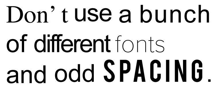
Your Typography is a Headache to Read
Fonts can be fun, but they can also be a nightmare if not used correctly. Picture this: a potential client lands on your website, eager to learn more about your services, only to be greeted by a mishmash of fonts that look like a typographical circus. If your text is giving people headaches, it’s time for a typography intervention.
Typography plays a crucial role in making your content readable and engaging. When you go DIY, it’s tempting to get creative with fonts, thinking it adds personality. But in reality, it often adds confusion. Using too many different fonts, or choosing ones that are hard to read, can make your content look unprofessional and scattered.
Here’s a simple rule of thumb: stick to two or three fonts at most. A primary font for body text, a secondary one for headings, and maybe a third for accents or special highlights. These fonts should complement each other and be easy on the eyes. Think classic, clean, and professional—like a crisp, well-ironed shirt.
Lack of Contrast & Hierarchy
Beyond font choices, consider contrast and hierarchy in your typography. Contrast ensures that your text is readable, especially for clients who might have visual impairments. Light gray text on a white background? Not a good look. Aim for high contrast—dark text on a light background or vice versa—to ensure everyone can read your content without squinting.
Hierarchy in typography is all about guiding your reader’s eye to the most important information first. Use different font sizes, weights, and styles to create a clear visual hierarchy. For instance, your headings should be larger and bolder than your body text, and subheadings should stand out too, though not as much as the main headings. This helps readers quickly scan and understand the structure of your content.
Consistency is key. Use the same fonts across all your materials—your website, brochures, business cards, and social media. This uniformity reinforces your brand’s identity and makes your content more digestible. After all, you want your clients focusing on your message, not straining to decipher it.

Common Pitfalls to Avoid
Overly decorative fonts for main text: While they might look cute in small doses, they can quickly become tiresome and difficult to read in longer passages. Instead, opt for fonts that are clear and legible. Serif fonts like Times New Roman or sans-serif fonts like Arial are safe bets for readability.
Inconsistent font usage: Stick to your chosen fonts across all platforms to maintain a cohesive brand identity.
Poor contrast: Ensure your text color contrasts well with your background to improve readability.
By getting your typography right, you’ll make your content more accessible, professional, and engaging. So, ditch the font frenzy and aim for a clean, readable look that enhances your message.
Your Designs Scream DIY
Ah, Canva. The beloved tool for quick, easy designs. While Canva and similar platforms have democratized graphic design, making it accessible to everyone, they’ve also led to a wave of cookie-cutter, overly trendy templates that scream DIY. If your practice’s branding looks like it was plucked from a template that a thousand others are using, it might be time to rethink your approach.
Here’s the deal: While those free templates are convenient, they often lack the uniqueness and polish that a professional designer can provide. They’re great for quick social media posts or informal projects, but relying on them for your main branding elements can cheapen your brand’s image. When clients see those same designs elsewhere, it undermines the sense of professionalism and individuality you’re trying to convey.
The Pitfalls of Trendy Templates
Using trendy templates can be a double-edged sword. Sure, they might look stylish now, but trends fade. What’s in vogue today could be passé tomorrow. This means your brand risks looking outdated as soon as the next design trend rolls around. Plus, those trendy templates often lack the depth and adaptability needed for a cohesive brand identity.
The DIY Look
The hallmark of a DIY design is often an over-reliance on default fonts, mismatched color schemes, and generic stock images. These elements can create a disjointed, amateurish feel that detracts from the professional image you want to project. When your designs look like they’ve been pieced together without a unifying vision, it can signal to potential clients that you might approach your therapy practice with the same lack of cohesion.
Investing in custom design work doesn’t just set you apart; it communicates that you value your practice and your clients enough to invest in high-quality branding. A professional designer can create custom graphics, choose color schemes that reflect your brand’s personality, and ensure that every visual element works together harmoniously.
The Professional Touch
Professional designers bring more to the table than just technical skills. They bring a deep understanding of branding principles, visual hierarchy, and design trends. They can help you develop a visual identity that not only looks great but also aligns with your brand’s values and goals. This investment pays off by attracting the right clients and setting a professional tone from the first interaction.
In short, while Canva and its ilk have their place, they shouldn’t be the cornerstone of your branding strategy. A unique, professional design will always outshine a template, helping your practice stand out in a crowded market.
Your Brand Lacks Consistency
Consistency might not sound glamorous, but in the world of branding, it’s a game-changer. Imagine your favorite restaurant serving your favorite dish differently every time you visit. Frustrating, right? The same goes for your brand. If your branding is all over the place, it can confuse and alienate potential clients.
Why Consistency Matters
Consistency in branding means that all elements—logos, color schemes, typography, imagery, and messaging—work together seamlessly across all platforms. It helps create a strong, recognizable brand identity that clients can trust. When your brand is consistent, it sends a message that you’re reliable and professional. Inconsistent branding, on the other hand, can make your practice look chaotic and untrustworthy.
Common Consistency Pitfalls
Mismatched Visuals: Using different logos, colors, or fonts across your website, social media, and printed materials can be jarring. It’s like showing up to a business meeting in mismatched socks—not a good look.
Inconsistent Messaging: Your tone and voice should be consistent in all your communications. If your website is formal but your social media is super casual, clients won’t know what to expect.
Varied Quality: High-quality images on your website but blurry photos on Instagram? This disparity can undermine your professionalism.
The DIY Dilemma
When you DIY your branding, it’s easy to fall into the trap of inconsistency. Maybe you designed your website with one tool, created your business cards with another, and used yet another for social media graphics. Each tool might have its own set of templates and styles, leading to a patchwork brand that lacks cohesion.
How to Achieve Consistency
Create Brand Guidelines: Develop a comprehensive guide that outlines your logo usage, color palette, fonts, imagery style, and tone of voice. This ensures everyone who works on your brand stays on the same page.
Use Consistent Tools: Stick to a set of tools and templates that align with your brand guidelines. This helps maintain visual and thematic consistency across all your materials.
Regular Audits: Periodically review all your branding materials to ensure they align with your guidelines. This helps catch inconsistencies before they become a bigger issue.
By maintaining consistency, you reinforce your brand identity and make a lasting impression on clients. They’ll know exactly what to expect from you, which builds trust and loyalty.
See Also: The Therapist's Guide to a Strong Visual Brand Identity

The Bottom Line
Branding is more than just a superficial facelift for your therapy practice—it's a critical component that communicates your professionalism, values, and dedication to potential clients. Avoiding common DIY pitfalls and investing in high-quality, consistent branding can transform your practice from looking unprofessional to polished and trustworthy. Remember, a strong brand not only attracts ideal clients but also builds trust and loyalty. If you're ready to take your practice to the next level, consider partnering with a professional brand designer. Together, we can create a cohesive and compelling brand that truly reflects the quality of your services. Let's make your brand as exceptional as the care you provide.


