
How to Write Calls-To-Action (CTAs) that Actually Work

Crafting the perfect call-to-action (CTA) is like inviting someone to dance—the approach needs to be engaging, clear, and timely. Your CTA is not just a button or a line of text; it's a critical bridge between user interest and action, guiding your visitors toward a deeper engagement with your therapy practice. In this guide, we’ll explore how to design, write, and place CTAs that not only capture attention but also convert visitors into clients. From understanding your audience's unique needs to optimizing CTAs through rigorous testing, each step is geared towards making your website not just seen, but inspires actions.
IN THIS ARTICLE:
Understanding Your Audience
Before crafting that perfect call-to-action (CTA) that converts visitors into clients, take a moment to really understand who's on the other side of the screen. Knowing your audience is like having a roadmap in a foreign city—it guides your way and saves you from getting lost. Here’s how to gain a deep understanding of your audience to make your CTAs as effective as possible:
Identify Your Primary Visitors: Are they busy professionals, stressed parents, young adults, or perhaps retirees exploring new chapters in their lives? Each group has different triggers and pain points.
Understand Their Needs: What are they seeking from your therapy services? Is it relief, guidance, support, or tools for self-improvement? Aligning your CTAs with these needs can make them irresistible.
Consider Their Journey: Where are they in their decision-making process? A visitor just beginning to explore therapy might be more receptive to a gentle nudge like "Learn More," while someone deeper into their research might respond better to a more direct "Schedule a Consultation" button.
Gather Insights: Use surveys, feedback forms, and website analytics to gather as much information as you can about your visitors. This data can provide valuable clues about what drives them to take action.
Understanding your audience not so much decodes a secret language as it tunes your message to speak directly to their hearts. Armed with this insight, you’re better equipped to craft CTAs that not only catch the eye but also resonate deeply with your potential clients.
Key Elements of an Effective CTA
Once you've tuned into your audience's frequency, it's time to craft a call-to-action (CTA) that sings. A great CTA doesn't just tell someone what to do; it makes them want to do it. Here are the essential elements that can turn a simple button or link into a compelling invitation:
Clarity and Conciseness: Your CTA should be crystal clear. Users should understand exactly what will happen when they click. Keep it short and sweet—usually no more than five words. Phrases like "Book Your Free Consultation" or "Download Our Therapy Guide" are direct and to the point.
Urgency and Scarcity: Creating a sense of urgency or scarcity can encourage quicker action. Phrases like "Limited Availability" or "Schedule Now to Secure Your Spot" can make the decision to click feel more pressing.
Visually Striking Design: Your CTA should stand out from the rest of the page. Use colors that contrast with the surrounding design but still fit within your overall branding. The button itself should be large enough to notice easily but not so large it distracts from the content.
Action-Oriented Language: Use active verbs that inspire action. Instead of passive phrases like "Information available here," opt for "Get Your Info Pack" or "Start Your Journey Today." This turns the CTA into a doorway to their next step, rather than a signpost.
Placement and Proximity: The placement of your CTA can significantly affect its effectiveness. It should be placed in an intuitive spot where users naturally focus, such as the end of a persuasive piece of content or a key turning point on the page. Also, keep it close to relevant information that might persuade a user to take action.
By combining these elements, you can create a CTA that not only catches the eye but also feels like the natural next step for your visitors. This way, you transform passive browsing into active engagement, guiding visitors closer to becoming clients.
Writing Compelling CTA Text
Crafting the text for your call-to-action (CTA) is like choosing the right key to unlock a door—it needs to fit perfectly to work effectively. The right words can make the difference between a visitor clicking through or scrolling past. Here’s how to write CTA text that not only grabs attention but also compels action:
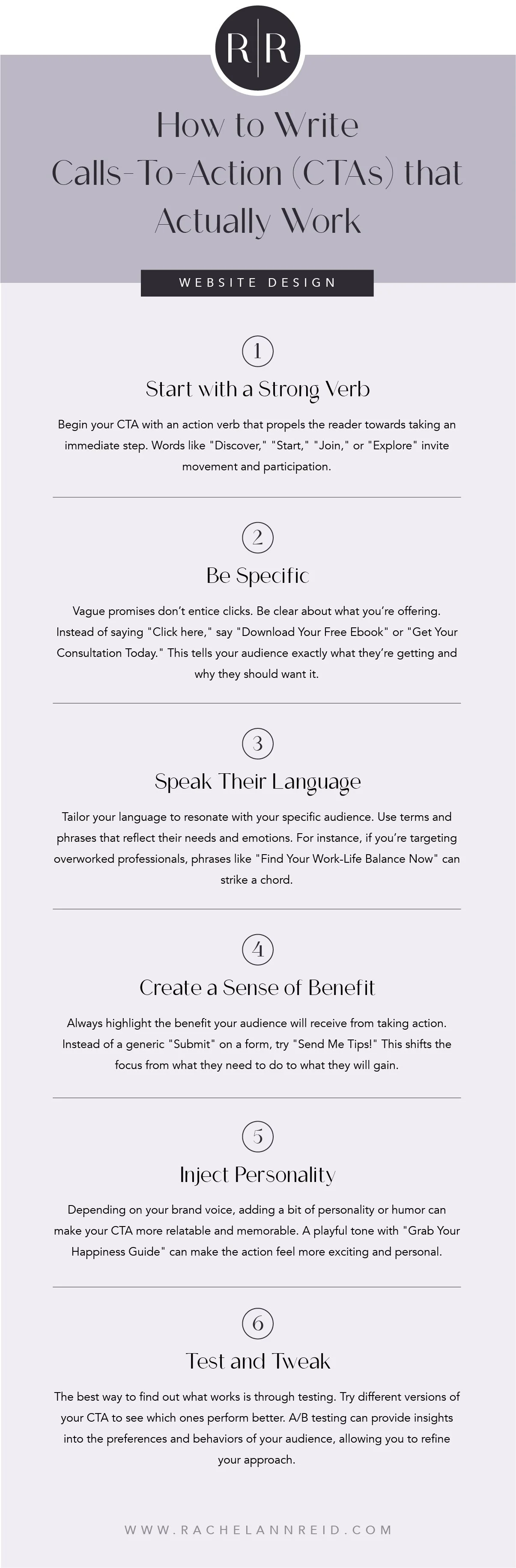
Start with a Strong Verb: Begin your CTA with an action verb that propels the reader towards taking an immediate step. Words like "Discover," "Start," "Join," or "Explore" invite movement and participation.
Be Specific: Vague promises don’t entice clicks. Be clear about what you’re offering. Instead of saying "Click here," say "Download Your Free Ebook" or "Get Your Consultation Today." This tells your audience exactly what they’re getting and why they should want it.
Speak Their Language: Tailor your language to resonate with your specific audience. Use terms and phrases that reflect their needs and emotions. For instance, if you’re targeting overworked professionals, phrases like "Find Your Work-Life Balance Now" can strike a chord.
Create a Sense of Benefit: Always highlight the benefit your audience will receive from taking action. Instead of a generic "Submit" on a form, try "Send Me Tips!" This shifts the focus from what they need to do to what they will gain.
Inject Personality: Depending on your brand voice, adding a bit of personality or humor can make your CTA more relatable and memorable. A playful tone with "Grab Your Happiness Guide" can make the action feel more exciting and personal.
Test and Tweak: The best way to find out what works is through testing. Try different versions of your CTA to see which ones perform better. A/B testing can provide insights into the preferences and behaviors of your audience, allowing you to refine your approach.
Writing compelling CTA text involves a blend of clarity, persuasion, and creativity. By focusing on what your audience needs and how they communicate, you can create CTAs that are not only noticed but acted upon. This step is critical in converting casual visitors into engaged clients, making it a powerful tool in your website’s arsenal.
Placement & Design of CTAs
The placement and design of your call-to-action (CTA) are critical to its success. Think of your CTA as the star of the show; it needs the right stage and spotlight to truly shine. Here’s how to strategically position and design your CTAs to maximize visibility and effectiveness:
Strategic Placement:
Above the Fold: Ensure your most important CTA appears in the upper half of your webpage, visible without scrolling. This captures attention right away.
At Natural Decision Points: Place CTAs at spots where users are most likely to make a decision—after a compelling piece of content, a list of benefits, or a persuasive testimonial.
End of Pages: Including a CTA at the end of blog posts or service descriptions gives users a clear next step after engaging with your content.
Design for Visibility:
Color Contrast: Use colors that stand out from the rest of your page but still align with your brand. The goal is to make the CTA immediately eye-catching.
Size and Shape: Make sure your CTA buttons are large enough to be easily clickable, especially on mobile devices. Rounded corners are often more visually appealing and perceived as friendlier than sharp edges.
Whitespace: Surround your CTA with enough whitespace to make it stand out. Crowding it with other elements can dilute its impact and reduce click-through rates.
Consistency and Repetition:
Keep it Consistent: Use the same style for all CTAs across your site to maintain a cohesive look and reinforce brand recognition.
Repeat Strategically: Don’t be shy about placing your CTA multiple times on long pages. As long as it's relevant and not overly intrusive, repetition can effectively nudge users towards taking action.
Responsive Design:
Adapt to All Devices: Your CTA should look great and function smoothly on any device—desktop, tablet, or smartphone. Ensure that buttons are touch-friendly and visible without zooming on smaller screens.
By thoughtfully considering the placement and design of your CTAs, you set the stage for increased user engagement and higher conversion rates. It's not just about making your CTAs stand out visually; it's about ensuring they are a natural and compelling part of the user journey on your website.
Testing & Optimizing Your CTAs
Creating effective calls-to-action (CTAs) isn't just about setting them up and hoping for the best—it's about continually refining and optimizing to achieve the best results. Testing and optimizing your CTAs is akin to fine-tuning a musical instrument; the better it's adjusted, the better it performs. Here’s how you can ensure your CTAs are hitting the right notes with your audience:
A/B Testing (Split Testing):
Experiment with Variations: Change one element of your CTA at a time—such as the text, color, size, or placement—and compare the performance of each version. This method isolates the impact of each change, helping you understand what works best.
Use the Right Tools: Tools like Google Optimize, Optimizely, or VWO can help you set up, run, and analyze A/B tests easily.
Heatmaps and User Recordings:
Visual Insights: Heatmaps show you where users are clicking on your pages, while recordings can show you how users interact with your site. Tools like Hotjar or Crazy Egg can provide these insights, revealing whether users are engaging with your CTAs or ignoring them.
Adjust Based on User Behavior: Use the insights from heatmaps and recordings to adjust the placement and design of your CTAs to better catch users' attention.
Conversion Rate Optimization (CRO):
Focus on Metrics: Keep an eye on your conversion rates—the percentage of users who click on your CTA and complete the desired action (like signing up or making a purchase). Low conversion rates may suggest a need for tweaks to your CTA.
Optimize Holistically: Consider the entire user journey and context around each CTA. Improvements to other elements of the page, like content quality, layout, or load times, can also boost CTA performance.
User Feedback:
Gather Direct Input: Don’t hesitate to ask your users directly through surveys or feedback forms about their experience with your CTAs. Sometimes, the most valuable insights come straight from the source.
Iterate Based on Feedback: Implement changes based on what you learn from user feedback and monitor how these adjustments affect performance.
Consistent Review and Update:
Stay Current: Online behaviors and preferences evolve, so what worked last year might not work today. Regularly review and update your CTAs to stay effective and relevant.
Keep Testing: Optimization is an ongoing process. Regular testing and updating are crucial to maintaining the effectiveness of your CTAs over time.
By actively testing and optimizing your CTAs, you ensure that your site remains dynamic and responsive to user needs and preferences. This proactive approach not only improves user engagement but also drives better outcomes, making your website a more effective tool in your digital strategy.

The Bottom Line
Your call-to-action is much more than a final touch; it's the key player in converting visitors into engaged clients. Through understanding your audience, crafting compelling text, strategically designing and placing your CTAs, and continuously testing and optimizing, you can significantly enhance the effectiveness of your digital outreach. Remember, the goal of your CTA is to resonate with potential clients in a way that feels personal and direct, encouraging them to take the next step in their therapeutic journey. By following the strategies outlined in this guide, you can ensure that your CTAs aren't just seen—they're acted upon, making your site a dynamic gateway to your services. Keep refining, keep testing, and most importantly, keep connecting with your visitors in meaningful ways.


