
12 Font Pairings Perfect for Your Therapy Website

Choosing the right fonts for your therapy website is more than just a design decision; it's a crucial part of creating a welcoming and professional online presence. The right font pairings can enhance readability, convey your brand's personality, and make your website feel cohesive and inviting. In this blog post, we'll explore 12 font pairings that are perfect for therapy websites, each chosen to help you connect with your clients and present your practice in the best light.
IN THIS ARTICLE:
How to Pair Fonts
Choosing the right fonts for your therapy website isn't just about picking something that looks nice. Font pairing plays a crucial role in creating a visually appealing, readable, and cohesive website that reflects your brand's personality. Let's dive into the why and how of effective font pairing.
Why Font Pairing Matters
Font pairing is essential for several reasons:
Establishing Visual Hierarchy: Different fonts can help differentiate between headings, subheadings, and body text, guiding the reader's eye through the content.
Enhancing Readability: The right combination of fonts ensures that your text is easy to read, which is particularly important for accessibility.
Creating a Cohesive Brand Identity: Consistent and complementary fonts help reinforce your brand's visual identity, making your website look professional and polished.
Related: The Therapist's Guide to a Strong Visual Brand Identity
Basic Principles of Font Pairing
Contrast: Combining fonts with differing styles can create visual interest and clarity. For instance, pairing a serif font with a sans-serif font is a classic approach that adds a pleasing contrast.
Harmony: While contrast is important, the fonts you choose should still complement each other. They should have a similar mood or feel that aligns with your brand's personality.
Consistency: Once you’ve selected your fonts, use them consistently across your website. This uniformity helps in creating a cohesive and professional look.
Popular Font Pairing Techniques
Classic Combinations: These are tried-and-true pairings that always work well together. Think of a serif headline paired with sans-serif body text.
Modern Pairings: Trendy and contemporary combinations can give your website a fresh and updated look. An example might be a bold sans-serif paired with a lighter, more delicate script font.
Experimental Pairings: For a distinctive and unique look, you might mix decorative fonts with minimalist fonts. This approach is riskier but can result in a highly memorable website if done correctly.
Tools & Resources for Font Pairing
To help you find the perfect font pairings, here are some resources:
Online Tools: Websites like Google Fonts and FontPair offer great suggestions and previews of how different fonts look together.
Typography Inspiration: Websites like Typewolf and Fonts In Use showcase real-world examples of effective font pairings.
Design Software: Tools like Adobe Creative Cloud offer a variety of fonts and built-in pairing suggestions.
Tips for Effective Font Pairing
Limit Your Font Choices: Stick to 2-3 fonts to avoid a cluttered appearance.
Ensure Readability: Your font choices should be legible on all devices, from mobile phones to desktop computers.
Test with Your Content: Before finalizing your font choices, test them with your actual website content to see how they look in context.
Consider Your Brand Personality: Choose fonts that reflect your brand's identity and appeal to your target audience.
Common Font Pairing Mistakes to Avoid
Overcomplicating with Too Many Fonts: Using too many different fonts can make your website look chaotic. Stick to a few well-chosen fonts.
Choosing Fonts That Are Too Similar: If your fonts are too similar, they won't create enough contrast, making it harder to establish a visual hierarchy.
Ignoring Readability: No matter how stylish a font is, if it's hard to read, it will frustrate your visitors. Always prioritize legibility, especially for body text.
By understanding and applying these principles, you can create a beautiful and effective font pairing that enhances your therapy website's overall design and readability.
Selecting the Right Fonts for Your Brand
Selecting the right fonts is a key aspect of branding that goes beyond mere aesthetics. Your font choices convey your brand's personality, values, and professionalism. For therapists, it's crucial that your website exudes trustworthiness, empathy, and expertise. Here's how to select fonts that align perfectly with your brand.
Understanding Your Brand Personality
Before diving into font selection, it's essential to have a clear understanding of your brand's personality. Ask yourself:
What are the core values of my practice?
How do I want my clients to feel when they visit my website?
What adjectives describe my brand (e.g., calm, professional, modern)?
Related: Unlocking the Power of Branding: Why Every Therapy Practice Needs a Brand Strategy
Font Categories & Their Associations
Serif Fonts: Traditional, trustworthy, and professional. These fonts have small lines at the ends of the letters and are great for conveying reliability and respectability. Examples include Times New Roman and Georgia.
Sans-Serif Fonts: Modern, clean, and approachable. Sans-serif fonts lack the small lines at the ends of letters, making them feel more contemporary and straightforward. Examples include Arial and Helvetica.
Script Fonts: Elegant, personal, and creative. These fonts mimic cursive handwriting and can add a personal touch. However, they should be used sparingly for headlines or accents due to their decorative nature. Examples include Pacifico and Great Vibes.
Display Fonts: Unique, bold, and eye-catching. These are often used for logos or headers to make a strong impression. Use these fonts to add a distinctive flair to your website. Examples include Lobster and Impact.
Matching Fonts to Your Brand
Calm & Soothing: If your practice focuses on creating a serene environment, consider using a combination of serif and sans-serif fonts. A serif font for headlines (e.g., Georgia) paired with a sans-serif font for body text (e.g., Lato) can create a balanced, calming effect.
Modern & Innovative: For a contemporary and forward-thinking practice, a sleek sans-serif font like Helvetica for headings and a complementary sans-serif font like Open Sans for body text can convey modernity and clarity.
Warm & Welcoming: To make your website feel more inviting, you might choose a friendly script font for accents (e.g., Pacifico) and pair it with a clean sans-serif font for readability (e.g., Raleway).
Testing Your Fonts
Once you have a shortlist of fonts that match your brand personality, it's crucial to test them:
Readability: Ensure your fonts are legible across all devices and screen sizes.
Compatibility: Check how the fonts look together and with your existing logo and color scheme.
Feedback: Get opinions from colleagues or clients to see how the fonts are perceived.
Finalizing Your Font Choices
Balance Style & Function: While it's important to choose fonts that look good, they must also serve their purpose effectively.
Consistency: Use your chosen fonts consistently throughout your website to create a cohesive look.
Licensing: Make sure you have the appropriate licenses for any fonts you choose, especially if they are not free.
Selecting the right fonts is a nuanced process that requires careful consideration of your brand's identity and your audience's needs. By thoughtfully choosing fonts that reflect your practice's values and personality, you can create a website that not only looks great but also resonates with your clients.
How to Set Up Your Fonts in Squarespace
Now that you've selected the perfect font pairings for your therapy website, it's time to set them up in Squarespace. This platform makes it easy to customize your site's typography to reflect your brand's personality and ensure a professional, cohesive look.
See Also: Why Squarespace is the Perfect Platform for Your Therapy Practice Website
Accessing Font Settings in Squarespace
Log in to Your Squarespace Account: Navigate to your website dashboard.
Enter the Website Menu: On the left-hand side, click on "Website" to open the website settings.
Select "Site Styles": This will allow you to customize various aspects of your site's appearance, including fonts.
Choosing & Applying Fonts
Global Text Styles:
Headings: Customize the fonts for your H1, H2, H3, etc. This ensures consistency across all your headings.
Body Text: Choose the font for your main content to ensure readability.
Buttons & Navigation: Set fonts for buttons and navigation menus to maintain a cohesive look.
Customizing Fonts:
Select a Font: Click on the font dropdown menu to browse available fonts. Squarespace integrates with Google Fonts and other font libraries.
Existing Font Pack: Choose from predetermined font pairings curated by Squarespace. These packs ensure that your fonts are harmoniously paired.
Full Font Library: Select a font from the entire Squarespace font library for more customization options.
Custom CSS: For fonts not available in Squarespace's library, use CSS to add your own fonts. This involves uploading your font files and using the
@font-facerule to integrate them into your site.
Adjust Font Settings: Customize the font size, weight, letter spacing, and line height to match your design vision.
Preview Changes: As you make adjustments, Squarespace provides a live preview, allowing you to see how the fonts look on your site.

Testing Your Fonts
Cross-Device Testing: Check how your fonts look on different devices (desktop, tablet, mobile) to ensure readability and aesthetic consistency.
Browser Compatibility: Ensure that your chosen fonts render correctly across various web browsers (Chrome, Firefox, Safari, Edge).
Best Practices for Font Usage in Squarespace
Consistency: Use the same fonts for similar types of content to create a unified look. For example, use the same font for all headings and another for body text.
Readability: Ensure your fonts are easy to read. Avoid overly decorative fonts for body text and keep contrast high between text and background colors.
Hierarchy: Use font size and weight to establish a clear visual hierarchy, guiding users' eyes through your content naturally.
Troubleshooting Font Issues
Fonts Not Displaying Correctly: Clear your browser cache or try viewing the site in an incognito window. Ensure that custom fonts are properly uploaded and linked.
Responsive Design Issues: Adjust font sizes and spacing in the mobile view settings to ensure text is readable on all devices.
Performance Concerns: Excessive use of custom fonts can slow down your site. Stick to a few well-chosen fonts to maintain a balance between design and performance.
Setting up your fonts in Squarespace is a straightforward process that can significantly enhance your website's look and feel. By following these steps, you can ensure that your font choices not only reflect your brand's identity but also provide a pleasant and professional user experience. Remember, if you need further customization or assistance, consider reaching out for professional web design services to perfect your site's typography and overall design.
12 Squarespace Font Pairings
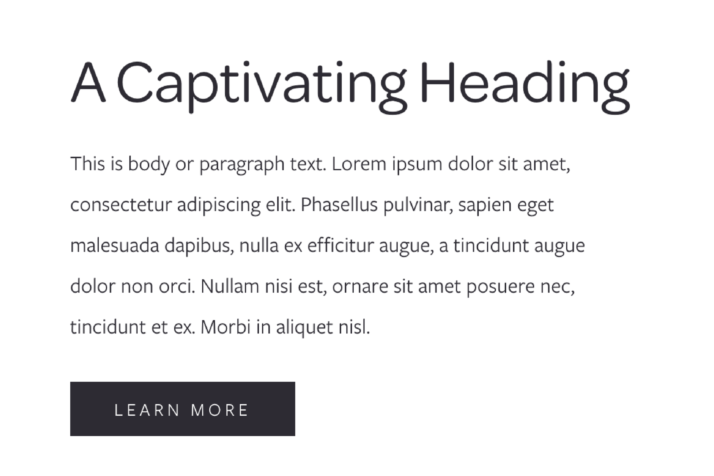
Omnes Pro & Freight Sans Pro
The pairing of Omnes Pro and Freight Sans Pro is ideal for a therapy practice because it strikes a perfect balance between warmth and professionalism. Omnes Pro, with its rounded edges, offers a friendly and approachable feel, creating a welcoming atmosphere for clients. In contrast, Freight Sans Pro's clean lines provide a touch of professionalism and credibility. Both fonts are highly readable, ensuring easy navigation and clear communication of information. This combination helps establish a calming yet trustworthy presence, which is essential for clients seeking comfort and confidence in their therapist.

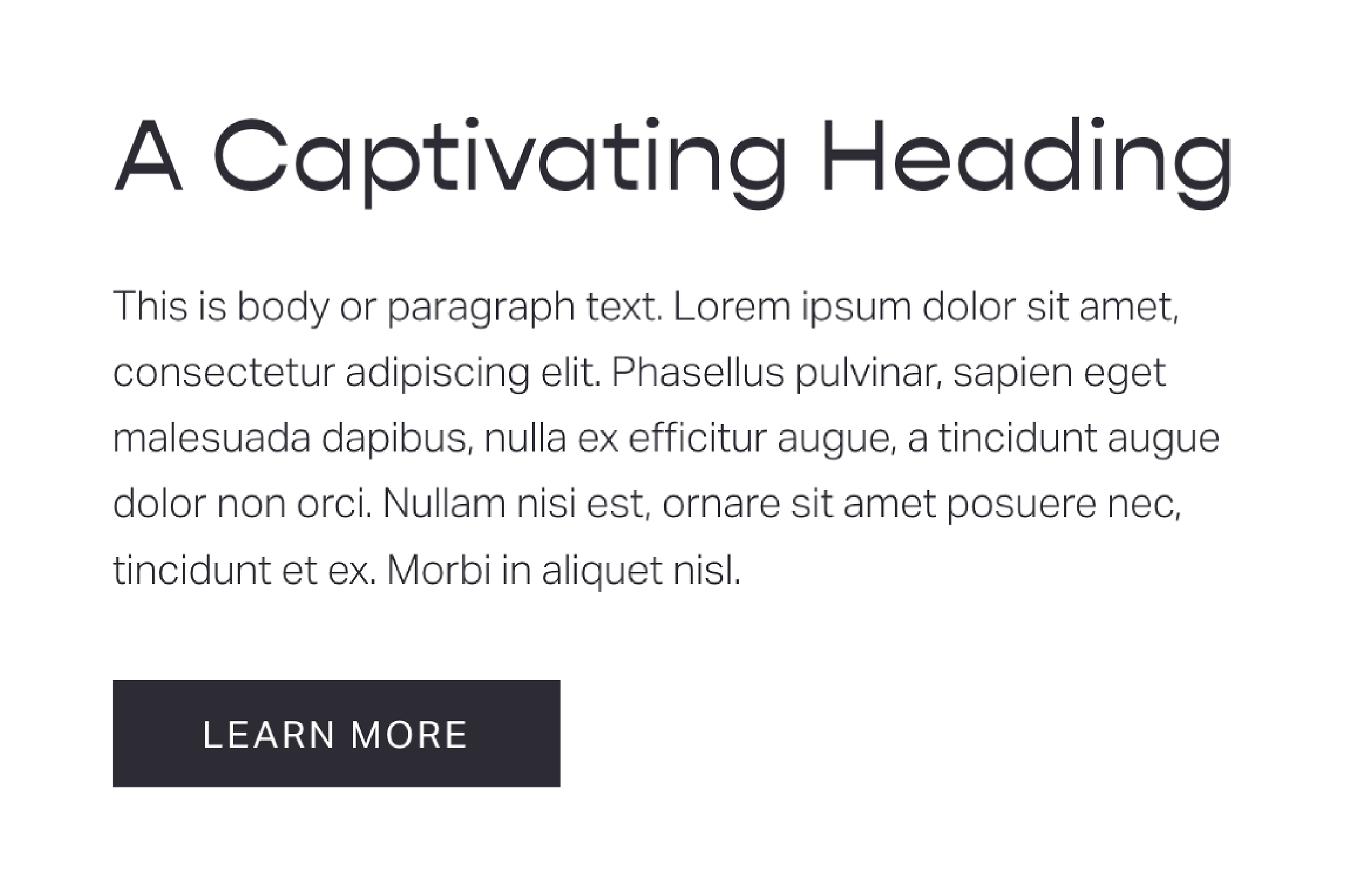
2. IvyMode & Sophia Pro
The combination of IvyMode and Sophia Pro is perfect for a therapy practice, blending elegance with a modern touch. IvyMode, with its sophisticated and graceful serif design, conveys a sense of tradition and trust, making it ideal for creating a professional and reassuring environment. On the other hand, Sophia Pro, a clean and contemporary sans-serif font, adds a touch of modernity and clarity. This pairing ensures that your website looks polished and refined while remaining approachable and easy to navigate. Together, they create a harmonious balance that reassures clients of your professionalism while providing a fresh and inviting user experience.

3. Playfair Display & Montserrat
The pairing of Playfair Display and Montserrat is an excellent choice for a therapy practice, combining classic elegance with modern simplicity. Playfair Display, with its sophisticated and high-contrast serif design, brings a sense of tradition, professionalism, and trust, making it ideal for headlines and important text. In contrast, Montserrat, a sleek and versatile sans-serif font, offers a contemporary and clean look that enhances readability and approachability. This combination ensures your website exudes a refined yet welcoming atmosphere, helping clients feel both confident in your expertise and comfortable navigating your site.

4. Quicksand & Raleway
The combination of Quicksand and Raleway offers an inviting and contemporary aesthetic, ideal for a therapy practice. Quicksand’s rounded, sans-serif design exudes warmth and approachability, making it perfect for creating a comforting environment for clients. In contrast, Raleway, with its sleek and elegant sans-serif lines, brings sophistication and clarity, ensuring all text is highly readable. This pairing achieves a visually appealing balance, presenting your practice as both professional and friendly, which is crucial for fostering trust and comfort in your clients.
5. Gopher & Aktiv Grotesk
Combining Gopher and Aktiv Grotesk creates a professional and approachable aesthetic, perfect for a therapy practice. Gopher, with its modern and slightly quirky sans-serif design, brings a sense of structure and friendliness, ideal for establishing a polished yet inviting online presence. Aktiv Grotesk complements this with its clean and straightforward sans-serif lines, enhancing readability and accessibility with a touch of casual elegance. This pairing strikes a harmonious balance, presenting your practice as both credible and welcoming, fostering trust and comfort in your clients while ensuring a clear and enjoyable user experience.

6. Antique Olive & Work Sans
Pairing Antique Olive and Work Sans creates a unique and engaging look, ideal for a therapy practice. Antique Olive, with its distinctive and slightly retro sans-serif design, adds a touch of character and warmth, making your website feel friendly and inviting. Work Sans, on the other hand, offers a modern, clean, and highly readable sans-serif style that ensures clarity and professionalism. Together, they create a visually appealing balance, presenting your practice as both approachable and competent, which is essential for building trust and making clients feel at ease.

7. Coranto 2 & Europa
Combining Coranto 2 and Europa brings a perfect blend of elegance and modernity to a therapy practice website. Coranto 2, with its refined and sophisticated serif design, conveys a sense of tradition, reliability, and professionalism, making it ideal for headlines and key information. Europa, with its sleek, minimalist sans-serif style, adds a contemporary and clean look, ensuring readability and a friendly tone. This pairing offers a harmonious balance, presenting your practice as both authoritative and approachable, which helps foster trust and comfort among your clients.

8. Span Condensed & Sweet Sans Pro
Pairing Span Condensed and Sweet Sans Pro creates a stylish and inviting look, perfect for a therapy practice. Span Condensed, with its elegant and narrow serif design, adds a touch of sophistication and professionalism, making it ideal for attention-grabbing headlines. Sweet Sans Pro, featuring a friendly and open sans-serif style, provides a modern and approachable feel, ensuring excellent readability. This combination strikes a balance between elegance and warmth, presenting your practice as both credible and welcoming, helping clients feel at ease and confident in your services.

9. Orpheus Pro & Poppins
Combining Orpheus Pro and Poppins creates a sophisticated and modern look, ideal for a therapy practice. Orpheus Pro, with its elegant and classic serif design, exudes a sense of tradition and trustworthiness, making it perfect for important headings and titles. Poppins, with its geometric and clean sans-serif style, brings a fresh and contemporary feel, ensuring excellent readability and a friendly tone. This pairing offers a harmonious balance of classic elegance and modern simplicity, presenting your practice as both professional and approachable, which helps clients feel both reassured and welcomed.

10. Utile Display & Brandon Grotesque
Choosing Utile Display and Brandon Grotesque for your therapy practice website creates a compelling and inviting aesthetic. Utile Display’s sharp and contemporary serif design adds a layer of sophistication and professionalism, perfect for capturing attention in headlines. Complementing this, Brandon Grotesque’s friendly and slightly retro sans-serif style provides warmth and approachability, ensuring excellent readability throughout your site. This combination seamlessly blends modern elegance with a welcoming feel, presenting your practice as both polished and personable, which helps clients feel at ease and assured of your expertise.

11. Aboreto & Proxima Nova
Combining Aboreto and Proxima Nova brings a distinctive and engaging look to your therapy practice website. Aboreto’s all-caps, whimsical, and decorative serif design adds a touch of creativity and emphasis, making it perfect for standout headings and attention-grabbing elements. Proxima Nova, with its clean and versatile sans-serif style, ensures modernity and clarity, providing excellent readability for body text. This combination balances playful elegance with a professional tone, showcasing your practice as both approachable and unique, which encourages clients to connect and engage with your services.

12. Ivypresto Text & Freight Sans Pro
Pairing Ivypresto Text and Freight Sans Pro creates a polished and inviting aesthetic for your therapy practice website. Ivypresto Text, with its graceful and sophisticated serif design, adds a touch of elegance and refinement, making it perfect for headings and key text. Freight Sans Pro, with its sleek and modern sans-serif style, provides clarity and readability, ensuring that your content is easy to navigate and understand. This combination strikes a balance between timeless sophistication and contemporary simplicity, presenting your practice as both professional and approachable.
The Bottom Line
Selecting the perfect fonts for your therapy website can significantly impact how clients perceive your practice. By carefully choosing font pairings that balance personality and readability, you can create a website that feels right, looks great, and encourages people to engage with your content. Whether you're aiming for a modern, classic, or unique look, these font pairings will help you convey the right message and ensure your content is easily readable. Remember, your website is often the first impression potential clients have of your practice—make it count with fonts that reflect your brand's personality and values. If you need further assistance with your website design or visual branding, don't hesitate to reach out for professional help to make your vision a reality.


